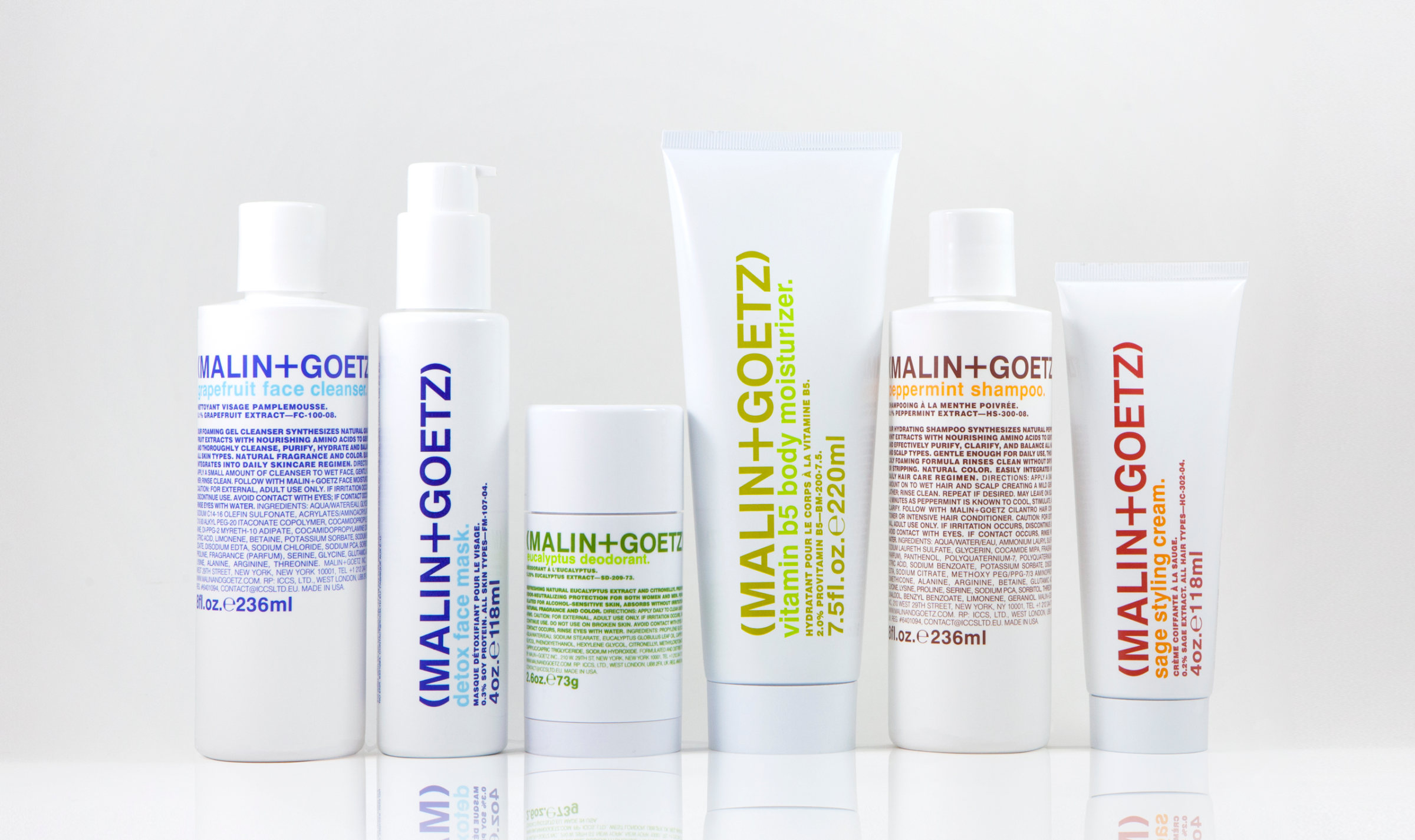
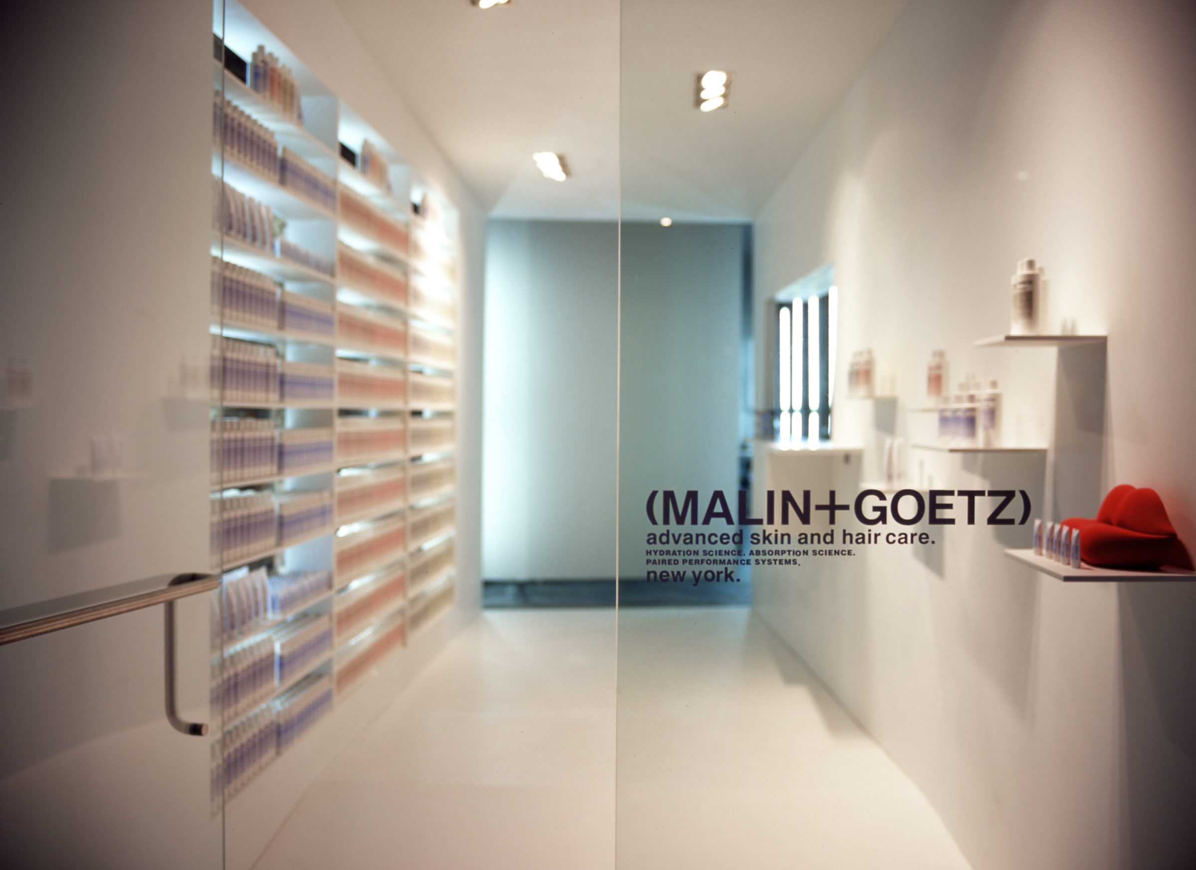
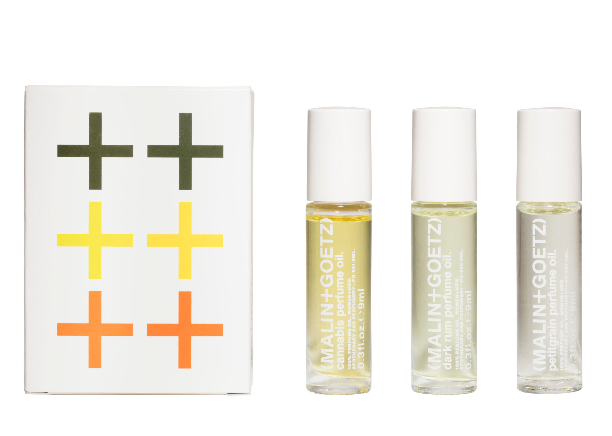
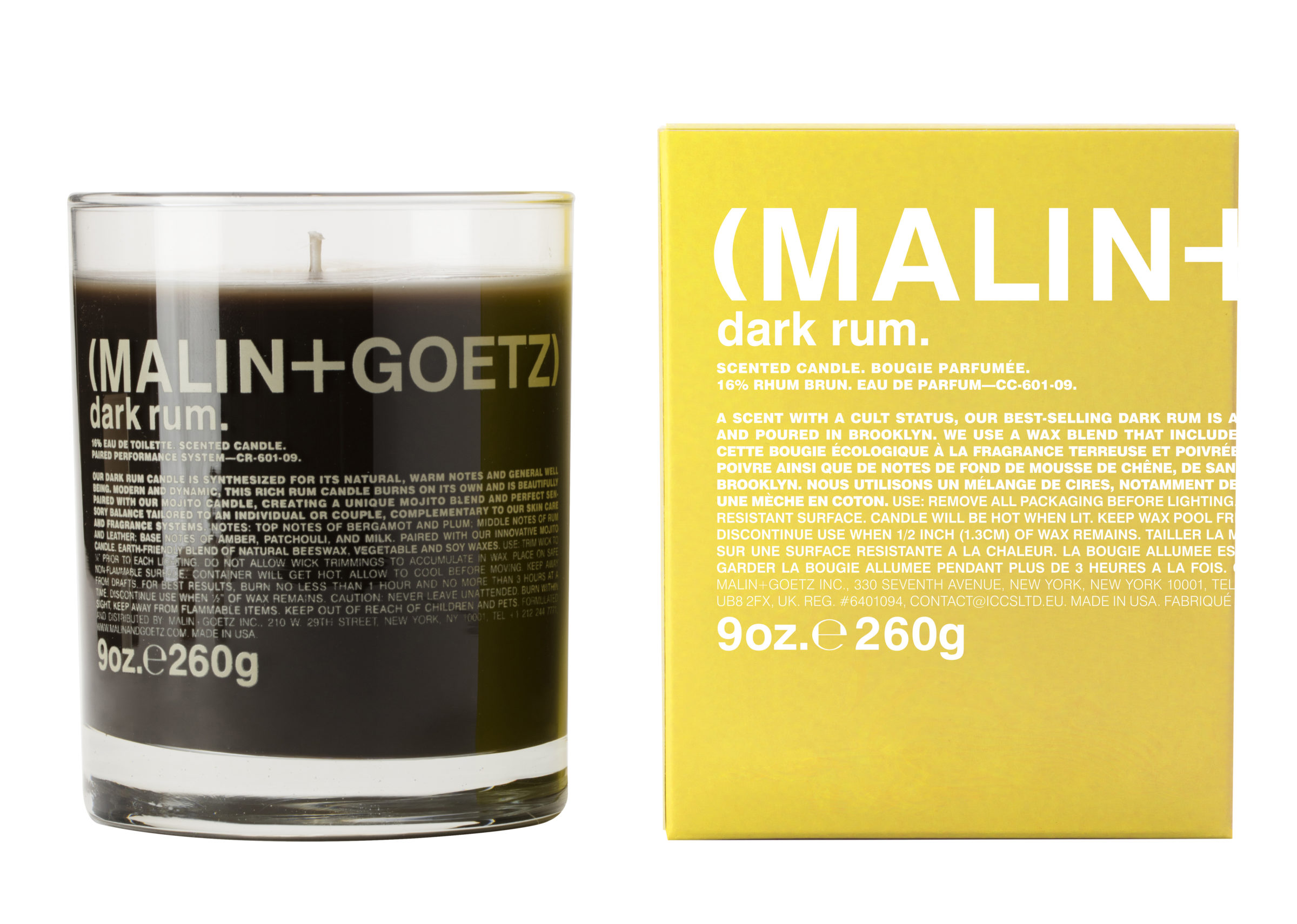
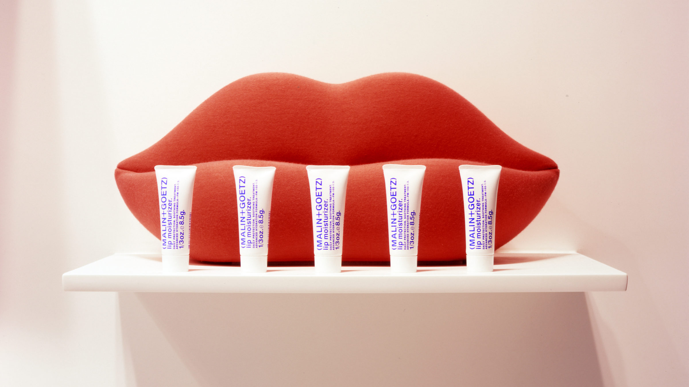
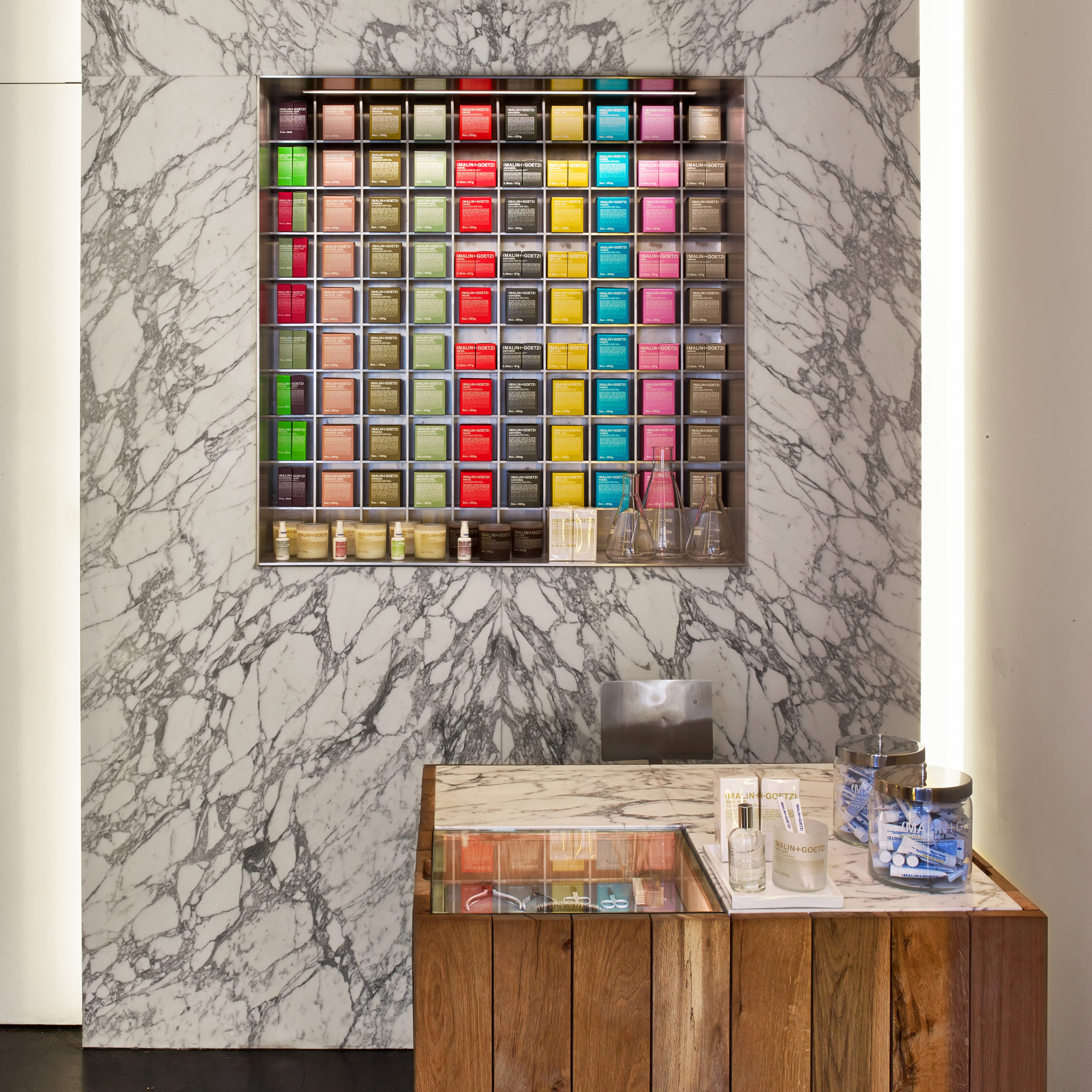
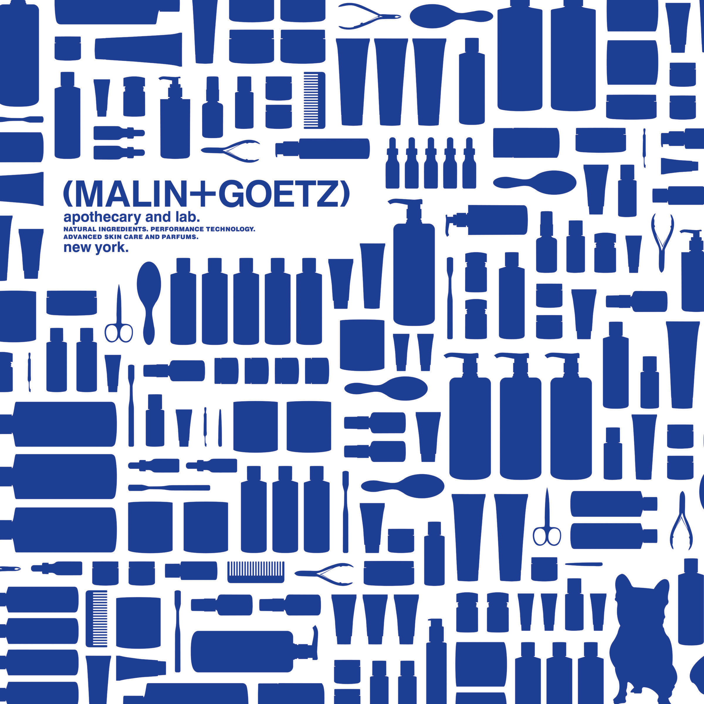
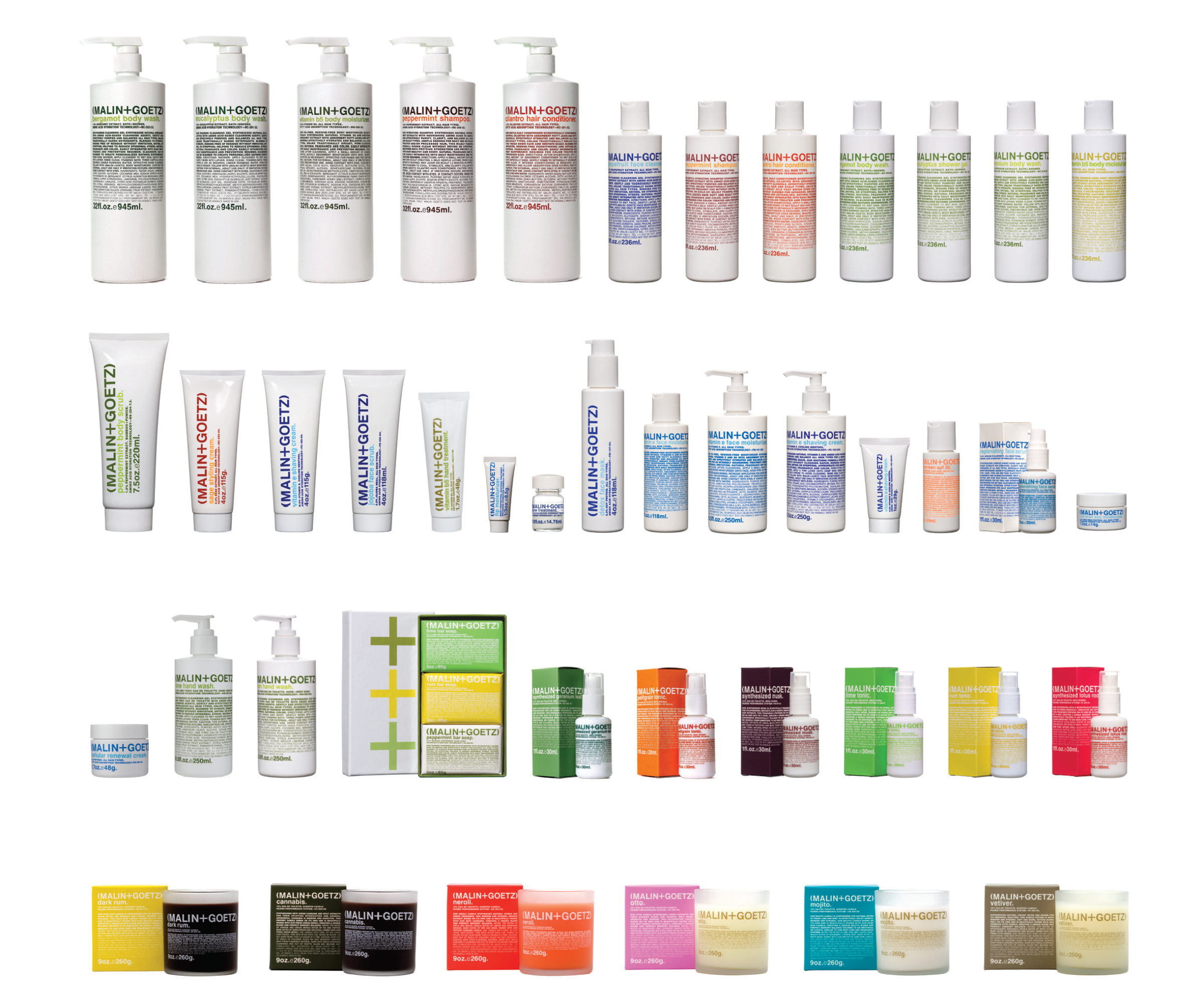
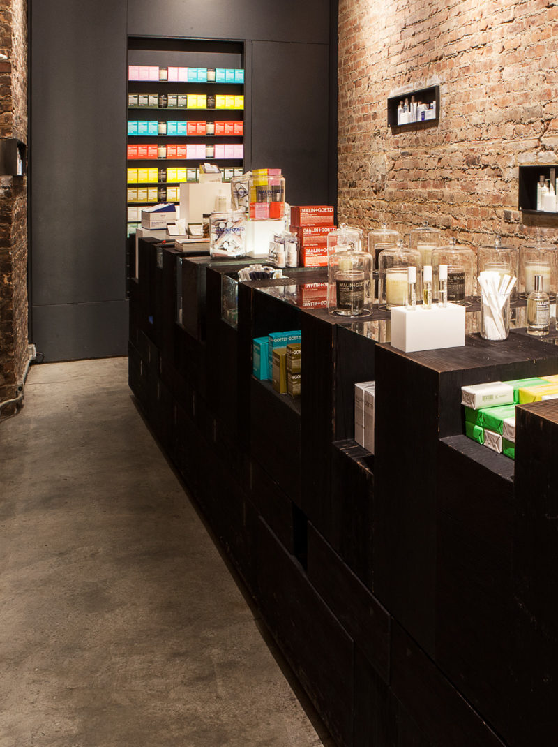
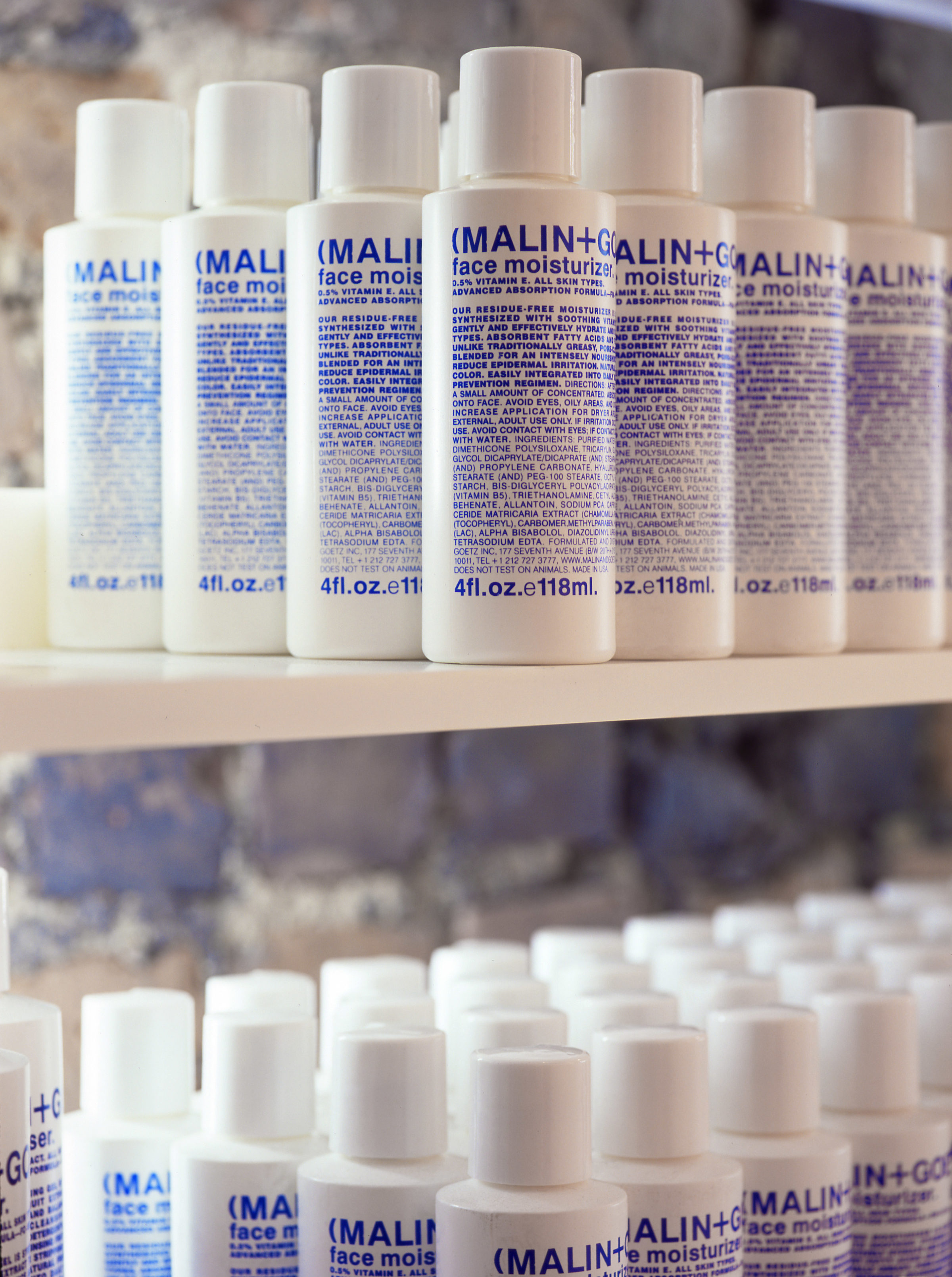
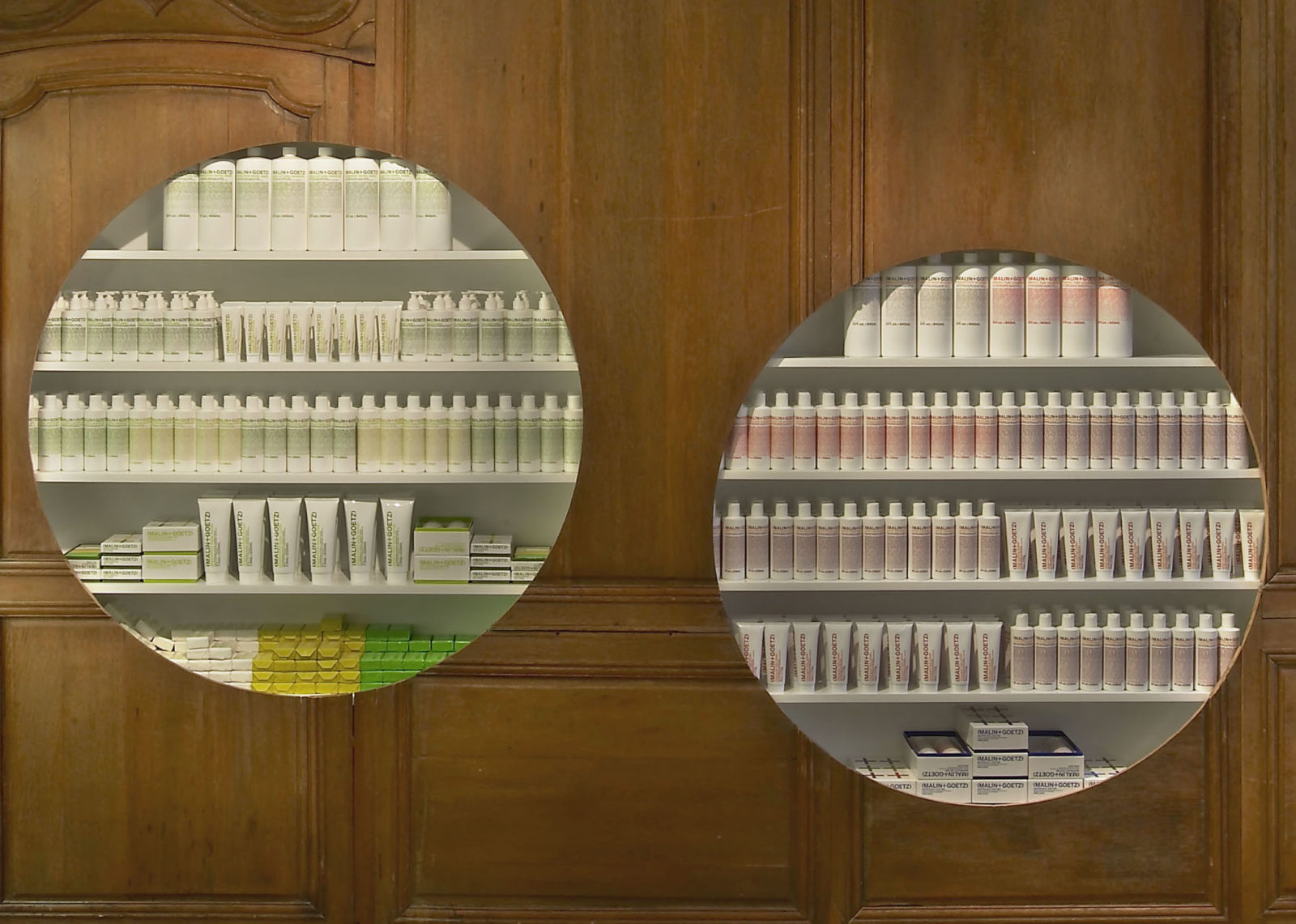
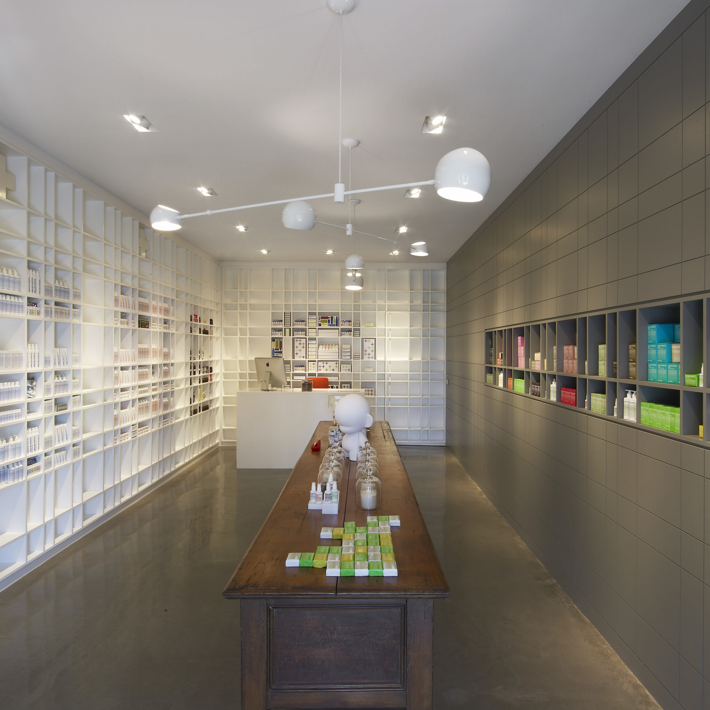
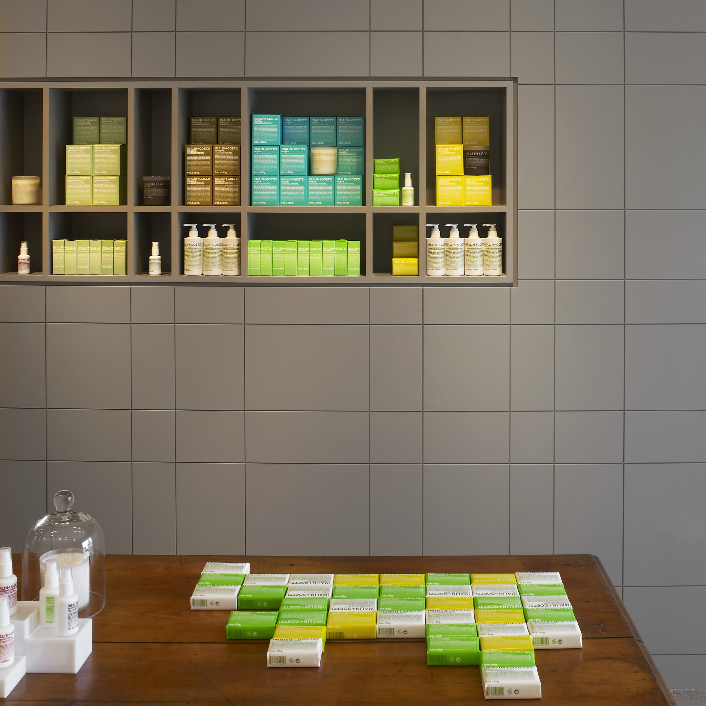
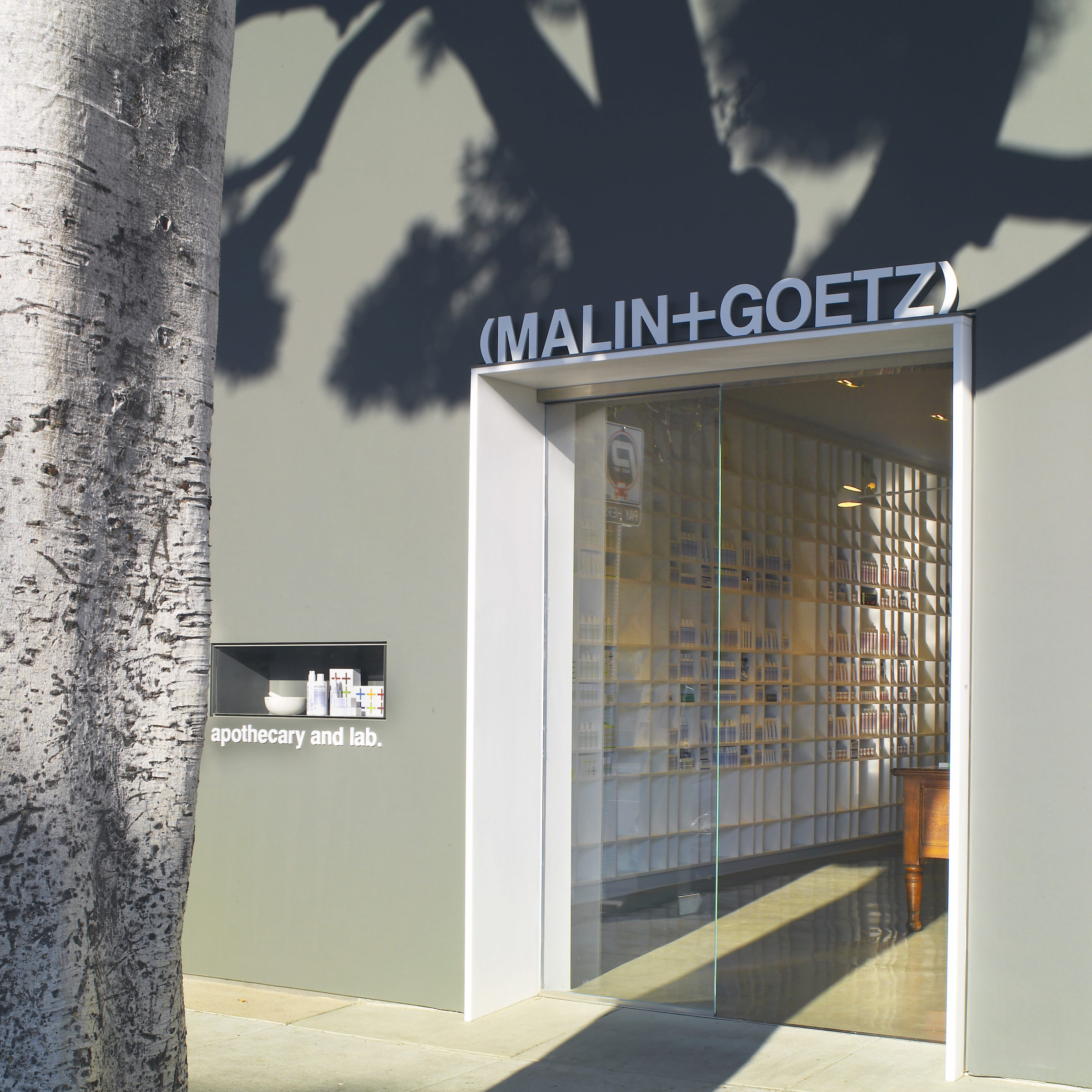
Matthew Malin and Andrew Goetz came to us with a plan to create a modern, unisex brand for their personal care line that referenced the visual language of the apothecary. The branding follows the product — clean, efficient, unisex, universal, contemporary, and personal. The design uses a simple, distinctive, elegant typographic system to tie all products together; a color system organized by product and into separate lines for face, body and hair. The packaging uses typography as a color field: when stacked together in a display, they form a larger, unified, changing field of color, each bottle a pixel in the composition. The project included the design of the product bottles and packaging, as well as print collateral, advertising, retail packaging, website, branding throughout the store locations, in-store window displays, and seasonal pop up stores.