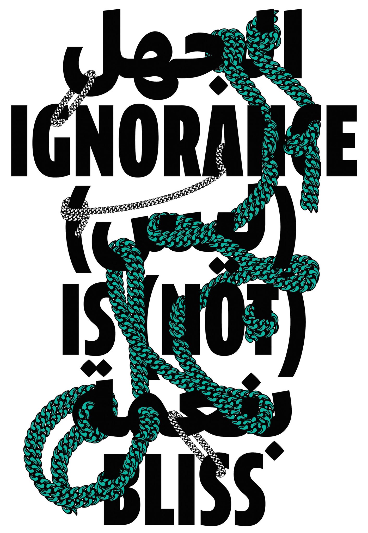
A poster made by the Lebanese graphic designer Kristyan Sarkis, based on a popular Western slogan and using English and Arabic type. Credit Courtesy of TPTQ-Arabic
This past summer, the producers of the award-winning television series Homeland had a problem. The principle photography for the fifth season was planned for Berlin but critical scenes were set in a Syrian refugee camp. The set dressers contracted the Arabian Street Artists — Heba Amin, Caram Kapp, and Don Karl (a.k.a Stone) — to provide a touch of Middle-Eastern authenticity to the Western European backgrounds by way of generic Arabic graffiti. In the frenzied final days leading up to the filming, it seems no one bothered to check the work. Only after the fact did the artists reveal they had bombed what they call “the most bigoted show on television.” Their tags were indeed political, just not in the way their employers had intended: they provided critiques of the program itself such as “Homeland is a joke, and it didn’t make us laugh,” and, more bluntly, “Homeland is racist.” The artists assert that their subversion was possible because in the eyes of the Western crew, “Arabic script is merely a supplementary visual that completes the horror-fantasy of the Middle East.”
It’s as if in this irrationally charged moment of hyper-xenophobia the mere presence of foreign writing is enough to evoke a gathering menace. Perhaps this is not so surprising, indecipherable texts are often metonyms for unknowable threats and unintelligible ideologies. Think of countless summer blockbusters where crates or tanks or missiles emblazoned with Cyrillic or Chinese characters portend certain doom. We tend to feel safe in our familiar alphabets. In turn, they link us to powerful traditions and communities. The origins of the little serifs on the corners of the letters you are reading here stretch back through the centuries, through revolutions, technological and intellectual, to the chiseled inscriptions on the monuments of ancient Greece and Rome. (Renaissance type designers, reviving the Roman letterforms, prized the inscriptions on Trajan’s Column as the most perfect model.) Like all designed objects, letters are inherently and incontrovertibly political and carry their ideologies embedded in their familiar forms.
If the Roman letter was born in stone, Arabic is a product of the pen. Arabic calligraphy links directly back to ancient scripture and the origins of Islam. The Koran was revealed to Muhammad in Arabic, and the distinctive letterforms are intertwined with the religion and culture of more than a billion people worldwide. That a writing system as lyrical and visually poetic as Arabic has come to signify something insidious — at least for Western eyes — is not just a little ironic. Arabic calligraphy represents one of humankind’s most generative and expressive graphic systems. (The so-called arabesque itself is often calligraphic inscription.) But while calligraphers embraced the most fanciful hand-drawn experimentation, the mechanization and standardization of Arabic letters was a contested act fraught with ominous cross-cultural implications.
While the first printing presses arrived in the Middle East within a century of Gutenberg’s prototypical disruptive technology, the region did not experience the same information revolution that mechanization engendered in Europe. In fact, the Ottoman bureaucracy almost concurrently outlawed, by penalty of death, the mechanization of Arabic text, ostensibly to safeguard sacred scripture from the infection of infidel technology, but also most certainly to protect the centralized authority of scribes who were in effect the productive engine of information dissemination. This outright rejection of typographic technology hobbled the development of an Arabic mass media for hundreds of years with significant cultural repercussions: information was heavily restricted by the theocracy, books remained rare and expensive, and literacy rates severely suppressed. The draconian restrictions were only eased in the mid-18th century, and even then only for secular information — scientific, mathematic, medical, and similar tracts — never sacred texts where mechanization bordered on blasphemy or at least cultural capitulation. Printed Arabic language newspapers, magazines, and periodicals would not be widely available until the 20th century.
Projecting a general disdain for printed media, Ottoman calligraphers did not apply their prodigious skills — an artistry honed over generations — to the design and production of moveable type, so the calligraphic never became fully typographic in the way, say, the handwriting of Medieval monks was transformed once it was carved onto blocks of wood and employed as typefaces on the bed of a printing press. As a result from Gutenberg on, presses, typewriters, linotype machines, computer type compositors, desktop publishing systems, and digital font authoring tools were mostly structured around the fixed logic European alphabets.
By the time restrictions against printing technology were finally lifted, designers faced a new challenge, the profound complexity of the writing system. With 29 letters each with at least 2 to 4 different forms and hundreds of possible unique letterform combinations, traditional Arabic simply wouldn’t fit the limited matrices of Western machinery designed to accommodate Roman upper and lower case letters. One remedy to this technological dilemma followed the typical imperial pattern: keep the machine, retrofit the culture. In the early 20th century, several versions of a simplified Arabic alphabet were developed in collaboration with local calligraphers — underwritten by Western tech giants like IBM and Linotype angling to open up new markets — to work efficiently within the confines Roman-based systems. Simplified Arabic was extremely successful, and still used throughout the world, but in reducing and standardizing the alphabet, large swaths of the cultural heritage were necessarily edited out.
Only within the last few years have new digital tools, combined with a youthful creative energy, offered the possibility of a full typographic Arabic that coalesces the dizzying eclecticism of the traditional writing systems, deep historical continuity, and contemporary font production. This movement can be linked to a dedicated cadre of young, highly-skilled, Middle-Eastern designers, many of them autodidacts versed in cutting edge developments of Roman-based digital font authoring, applying that knowledge, and those tools, to their native typographies. Huda Abi Fares is notable. Born in Beirut, Abi Fares studied design at RISD and Yale in the 1980s at the height of the Swiss modern influence. She applied that background in hard-core modernism to the problem of cross-cultural type design. Her non-profit Khatt Foundation, founded in 2004 in Amsterdam where she now resides, pairs European and Arabic designers in a project she calls “Typographic Matchmaking.” The immediate goal is to create fonts, and font-generation tools, that share influence from both East and West and to juxtapose designers from dramatically different aesthetic traditions. The broader mission is to build a vibrant Arabic design community. The Khatt Foundation website showcases the work of more than 1,700 young designers from diverse cultures crafting new typographic idioms. She sees these emerging designers as the cultural descendants of generations of Arabic calligraphers, applying their artistry in a new, inherently democratic and shareable, medium.
Two alumni from the matchmaking project, Slovakian Peter Bilak from the Hague, a world renowned designer of Roman alphabets, and his one time student, Lebanese designer Kristyan Sarkis, have since established TPTQ, a new type foundry focusing on the development of high-quality unified Arabic/Roman font families designed for global digital distribution (think of bilingual contexts such as an airport or a highway network that call out for an aesthetic coherence between writing systems.) They are applying the sophisticated processes and software that transformed Western type design to the challenges of Arabic, and simultaneously looking at Roman fonts through the lens of the calligraphic tradition. Such nascent efforts point to a global modernization that doesn’t come at the cost of cultural specificity or aesthetic homogenization, but builds on rich calligraphic and inscriptional strains to create new forms of expression reflecting both sides of the cultural divide in equal measure.
In our current dystopian rupture of extreme anti-cosmopolitanism, where every form of other — from whatever perspective other is rendered — is subject to suspicion and vilification, any project that seeks to find collegiality and common ground is welcome. Type designers spend their lives deep in the minutiae of reading, seeking to permeate the hidden visual codes woven in the fabric of our language. Much of that work is completely overlooked. There is no form of design that is less noticed or more prevalent: Type touches everyone. Perhaps, just perhaps, these young designers can find one way to cross whatever chasm is dividing us. The task is increasingly urgent. We literally can’t read each other.
A shorter version of this article appeared in T Magazine on March 17, 2016.
© Michael Rock