“Only he is alive who rejects his convictions of yesterday.”
Malevich
Like enraged citizens, long denied political rights, bursting into the palace, graphic designers have swarmed into the heretofore shrouded fraternity of letterform design and seized control. The digital reformation of the type founding industry is complete and the story of typographic democratization, with it’s vaguely Reaganistic undertone of deregulation and free market capitalism, is old news. Type will never be produced, as it once was, within a guild-like enclave. The craft republicanism and labor unionism that once encircled letter-making are gone forever. But as exciting as the results of the type revolution have been, it is hard not to feel a speck of remorse for the decimation of another craft, and another organized group of craftsmen, by a handful of young punks with personal computers.
Now the means of type production have been decentralized, the integrity of a letterform can longer be measured by traditional yardsticks like mastery of tools and processes, quality of handwork, and historical continuity. But a new typographic rhetoric has filled the gap left by the opening of the industry. The stabilizing – and some would say stultifying — influence of the apprentice system has been replaced by an order that locates the letterform as a site for visual experimentation and the alphabet as a screen onto which designers project their creativity. Working in the new digital foundry, the contemporary type designer carries the baton of Van Doesburg, and the ideals of the avant-garde, in the insatiable quest for originality, the cornerstone of modernism.
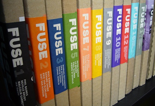
Fuse magazine has been an unofficial mouthpiece for the party of digital typography. Conceived and created by Neville Brody and Jon Wozencroft, and distributed as a quasi-promotional piece by FontShop International, Fuse is marketed (for £25) as an “interactive” magazine-on-diskette with experimental typefaces, printed specimen sheets, an editorial essay, and biographical and creative notes by the designers. Fuse fonts — usually four to a set although there tends to be a few bonuses thrown in for good measure — are offered as works-in-progress and subscribers are encouraged to customize them by fiddling with their handlebars and corner points. That’s apparently where the interactivity comes in, although aside from the designer’s approbation, there is nothing inherent about a Fuse font that makes it more malleable than any other PostScript font for the electronic doodler with a copy of Fontographer and time to spare.
The typefaces in each issue reflect, more or less, a general idea — religion, exuberance, (dis)information, etc. — that serves as the overarching theme each quarter. Fuse editor Jon Wozencroft opens Issue 1 optimistically anticipating “a dynamic new forum for typography will stimulate a new sensibility in visual expression, one grounded in ideas, not just image.” He closes his inaugural essay with “we must clear the cobwebs that cover the type that has so quickly been digitalized and dumped in the system folder. Otherwise we will be left deeper in a digital nightmare, plundering as many hot metal typefaces as possible to compensate for our lack of imagination. We will pretend to be in command of our language, but will actually be locked in a museum.”
The first issue iterates a familiar lament: the typographic establishment — perhaps the repressed memory of an overbearing father figure in the form of curmudgeonly typography professor — is inherently conservative and restrictive. Some unnamed mafia of modernists is insisting on legibility without understanding that times are a-changing. It is a classic generation gap and the parents just can’t relate to the new music that drives the kids wild. The story is so familiar by now that the idea of some grand modernist conspiracy theory is becoming a part popular designer mythology.
The idea is revisited in Issue 4. Using anti-establishment language of youth rebellion, Phil Baines writes “[t]ypeface designers today are Modernist law-abiding citizens who police their forms within the strict confines of function.” In the same issue, Jeff Keedy educes the age gap, bemoaning the longevity of “an exhausted Modernism that refuses to die.” But even a cursory glance through a type-house manual or popular magazine from the last thirty years should dash the idea that the world ever tottered on the brink of some kind of global Helevetican domination. The dominance of a single, homogeneous modernist theory is a designer’s fantasy. Talk of timeless letterforms and rational organization has never made it far beyond the typography class, the corporate design consultancy, or the international airport signage system. And letterforms have never been inviolate, only the tools to screw them up have changed; from brush and ink to camera to computer.
After the first couple of issues, the subject of Wozencroft’s essay and the idea of “a dynamic new forum for typography” part company. Typography in itself is rarely discussed in the copy. Wozencroft seems intent of linking the formal gestures of letterforms to larger issues of contemporary culture, not by direct reference but by juxtaposition. The editor muses on a whole range of subjects from virtual reality (#5) to violent cinema (#7) — the connection between theme, type and essay getting increasingly tenuous — until Fuse 9 (Auto) which features a polemic on negotiating London traffic.
But while the intention of the writing is occasionally nebulous, the real focus is the type itself, and the list of Fuse contributors reads like a litany of famous young designers: Phil Baines, Neville Brody, Malcolm Garrett, Ian Swift, Peter Saville, Rick Vermuellen, Rick Valecenti, David Carson, and on and on. Fuse’s real gift is not for prose but for visual play and it affords the opportunity for a series of talented designers to explore aspects of form-making outside of the expected restrictions of the typical design brief. The fonts range from the purely formal to the highly conceptual to the completely irrational. While some stand as viable headline faces — that turn up in the most unexpected places — others openly defy the possibility of use.
The openly defiant types — like Tobias Frere Jones’ Reactor (Fuse 7) in which each character gradually bespeckles earlier lines with “noise fields” as typing progresses (“the more you type, the worse it gets…”) — are the most interesting in that they suggest an experimentation that works both on the level of idea and form. My favorite of the series is Paul Elliman’s performance based font (F Alphabet, Fuse 5) produced in a downtown photo booth with 26 participants playing the letters. These fonts question the very idea of repetition made possible by new technology, the meaning of formal choices, and the linguistic contingencies of the media.
Other faces evoke historical precedents outside of the canon of fine typography like Victorian display faces (Keedy’s Lush Us) or the goofy, round-cornered futurism of the early seventies (Moonbase Alpha by Cornell Weidler.) The conflict between the systematic and the decorative is evident in the contradictory methods the type designers bring to bear on their projects. An undying fascination with the modular is still clearly present in fonts like Eric Speikermann’s Grid, Decoder by Gerard Unger, and InTegel by Martin Wenzel, as is a continued fixation with the overtly irrational present in Pierre DiSciullo’s Scratched Out and Rick Valicenti’s Uck N Pretty.
Perhaps the most curious aspect of the magazine is the poster collection that serves as a showcase for each issue’s assembled talent. But next to the lively type design, the compositions seem loose and unfocused. Each is a two-color font specimen demonstrating one of the featured alphabets, although most of the posters seem to shirk that feature of their job. Almost uniformly uninteresting, the folded broadsides are a testament to the character building benefit of work. With no real function to preform — aside from the vague purpose of connoting the spirit of the letterforms — the posters slip into dilettantish speculation and formalism, resorting to frivolous competition among themselves.
Just beneath the surface of all this furious experimentation lurks a stated desire to re-mystify modes of linguistic expression. There is an almost palatable longing for some spiritual past in which alphabets possessed a totemic significance. Fuse is a conscious effort to reinvest letters with some kind of magical power. But all the rhetoric about a new form of writing or an acquired legibility occludes the real significance of experimental type design. Fuse is not a project about type at all. The alphabet is not a vehicle for communication as much as a backdrop or a common ground against which the designers spin their elaborate narratives. While the forms assume the variegated surface of post-modernism, the underlying issues indicate projects like Fuse are deeply rooted in modernist goals of avant-garde experimentation and artistic originality.
In her essay “The Originality of the Avant-Garde,” art historian Rosalind Krauss demonstrates that modernism operates within the tension between two dialectically opposed terms; the exalted idea of originality and the degraded notion of repetition. Originality is certainly one of the overarching tropes of twentieth century art, from Ezra Pound’s admonition, “Make it new!” to the Futurist calls for the destruction of history. Tschichold’s claims of a “New Typography” and through to the lust for experimentation in contemporary projects like Fuse and Emigre. The violent disruption of some putative historical stricture becomes an enduring modern theme. The language of the Futurist manifesto, in which Marrientti conflates the museum with the crypt or the cemetery, can be heard to echo in Wozencroft’s evocation of designers locked in a cobwebbed museum of historical revival.
But the alphabet poses a unique contradiction to the quest for originality and the neomania that marks the modern movement. The alphabet — not unlike the grid Krauss points to as the foundational metaphor invoked in modern painting – is inherently orginless. The alphabet is a given it predates all who come to it. And so every designer that works in the grid provided by the conventional forms of the alphabet is condemned — to use a degraded term — to endless repetition of those accepted forms. The designer can manipulate them only insofar as the constructed form is still within the realm of what is known to be the letter. Once that boundary has been crossed, the designer reverts to a skillful maker of plastic form but can no longer claim to work in the domain of the linguistic. While Fuse may gaze longingly toward an antediluvian paradise of a magical pictorial languages, it is the retentive and unyielding persistence of the alphabetic structure that becomes both the modern canvas and the benchmark against which the genius of the contemporary type designer is measured.
In this light, Fuse is a project about the brilliance of the participants and the clever manner in which they redefine the boundaries of the project. In lionizing the experimental, Fuse promotes popular notions of artistic genius, originality and authenticity; terms that, following Walter Benjamin, traditionally invest art, and the institutions that house it, with value. But that originality is always undermined by the fact that the alphabet itself can never be re-invented; it can only be endlessly repeated. In addition, the popular sentiment that places the locus of formal innovation squarely in the hands of the artist and the authentic artistic object, is confounded by a product, a typeface, that can exist only in multiple and only through the mass-production process of typefounding; manual, mechanical, optical or digital. This contradiction is evidenced by the losing battle to protect the property rights that govern the intellectual ownership of a letterform.
The strategies concocted by high modernist designers to advance the cause of anonymous typeforms, under the guise of legibility or historicism, are generally misread. Conventional post-modern grumbling imagines a hygienic program organized to strip the world of decoration. But modernist promotion of characterless or timeless typeforms is actually a self-serving endeavor to protect the precious commodity of originality or authenticity that is left to the designed object. If artistic originality is key to the notion of modernism, the modernist object must, by its very nature, indexically refer to the genius of its maker. Swiss modernist Emil Ruder defined the typographer as one who wielded pre-existing forms: “The fact that the typographer has no contribution of his own to make to the form of the typeface but takes these ready-made is of the essence of typography.” The generic letter, like Helvetica, or the historic form that has by its very ubiquity become generic, functioned through transparency; by not interfering with the operation that connected the work directly to the maker. The authority of the designer lay in the ability to skillfully manipulate general forms into images that connoted individual originality.
As letterforms have become more personal, and have in themselves become intimately connected to their makers — not a workshop of mechanical craftsman as in the past, but a specific designer in front of a Macintosh — the originality of the designed object is increasingly muddled. The use of another designer’s form complicates the (provenance?) of the work. If a poster is designed using a typeface that is clearly identified with Neville Brody, is the genius of the design in the letterform or the arrangement of the letterforms? Who is the author of the work? Whose originality is paramount? At the same time, the genius of the type designer is dissipated as his or her fonts become widely available, allowing their signature style to be easily appropriated. As typefaces increasingly become indices of their designers, and become design statements in themselves, the crisis of design authorship intensifies.
It is fascinating that such vocal proponents of a kind of artistic freedom work in a medium that is so innately restrictive. The alphabet becomes, as Krauss puts it, “a prison in which the caged artist feels at liberty.” However, by the latest issue, Fuse 10/Freeform, ,it is apparent that the charm of that cell block is wearing thin. Type a line of Brody’s Freeform 2 and you get do not have font )a kind of abstract composition. The fonts in Freeform deliver a collection of abstract shapes liberated from the work of letterforms. These new shapes need only be evocative without the duty of consensual recognition although they seem to revert to the function of generic forms from which the artist may construct a masterwork.
Wozencroft reports that Fuse 10 was something of a watershed: “For some time we have been talking about our intention to create an outlet that uses the keyboard more as a musical instrument or palette of colors, and not to restrict its potential to the endless refinement, sophistication or abstraction of Roman letterforms.” But in throwing off the restrictive chains of the alphabetic grid, the goal of the project becomes clouded. As optimistic as ever, the editor finishes his essay almost mystically: “Freeform is an impulse that connects to the optical nerve net of cyberspace, whilst rooted in the primary convergence of magic art and writing.”
Yet like much of the rhetoric that surrounds these experiments, what that primary convergence is exactly remains murky. Like the indecipherable forms that appear on the screen using Freeform, the connection between intention and the form is increasingly vague. After ten issues of fervent pursuit, Fuse has come full circle. The hope for “a new sensibility in visual expression, one grounded in ideas, not just image” seems more precarious than ever. Fuse is faced with a difficult problem; once the governing force of the alphabet has been abandoned, what comes next?
Reading the prologue to Fuse 10, I recall an American animated cartoon in which after chasing the burning end of an impossibly long fuse across a desert, around a mountain, through a tunnel, over a bridge, under a house, etc, the bedraggled pursuer of the Roadrunner, Wily Coyote, finds himself back at the starting point, a stack of dynamite tied to his own tail. As the fuse burns to the end, he turns with a quizzical look to the audience. Quick fade to black. Explosion audible.
© Michael Rock