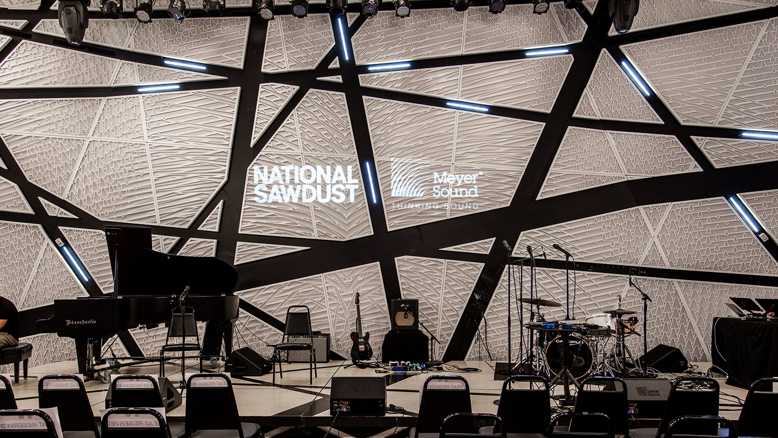
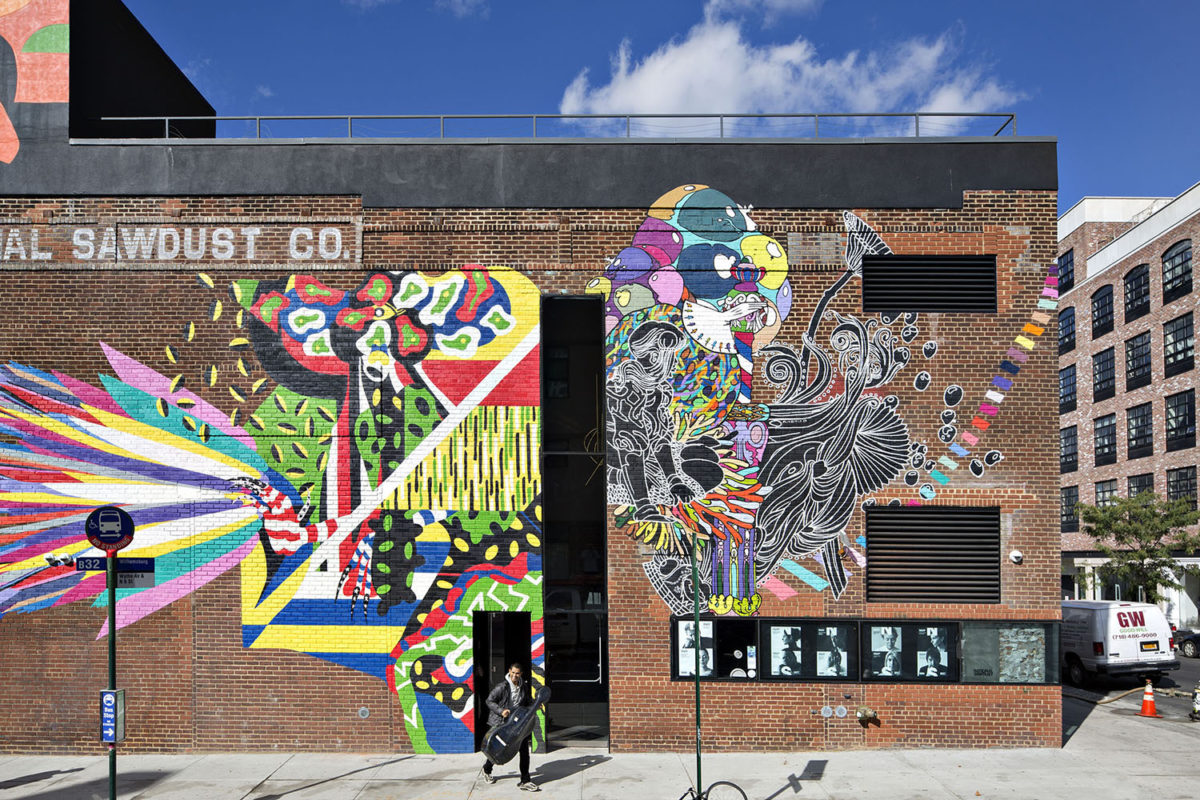
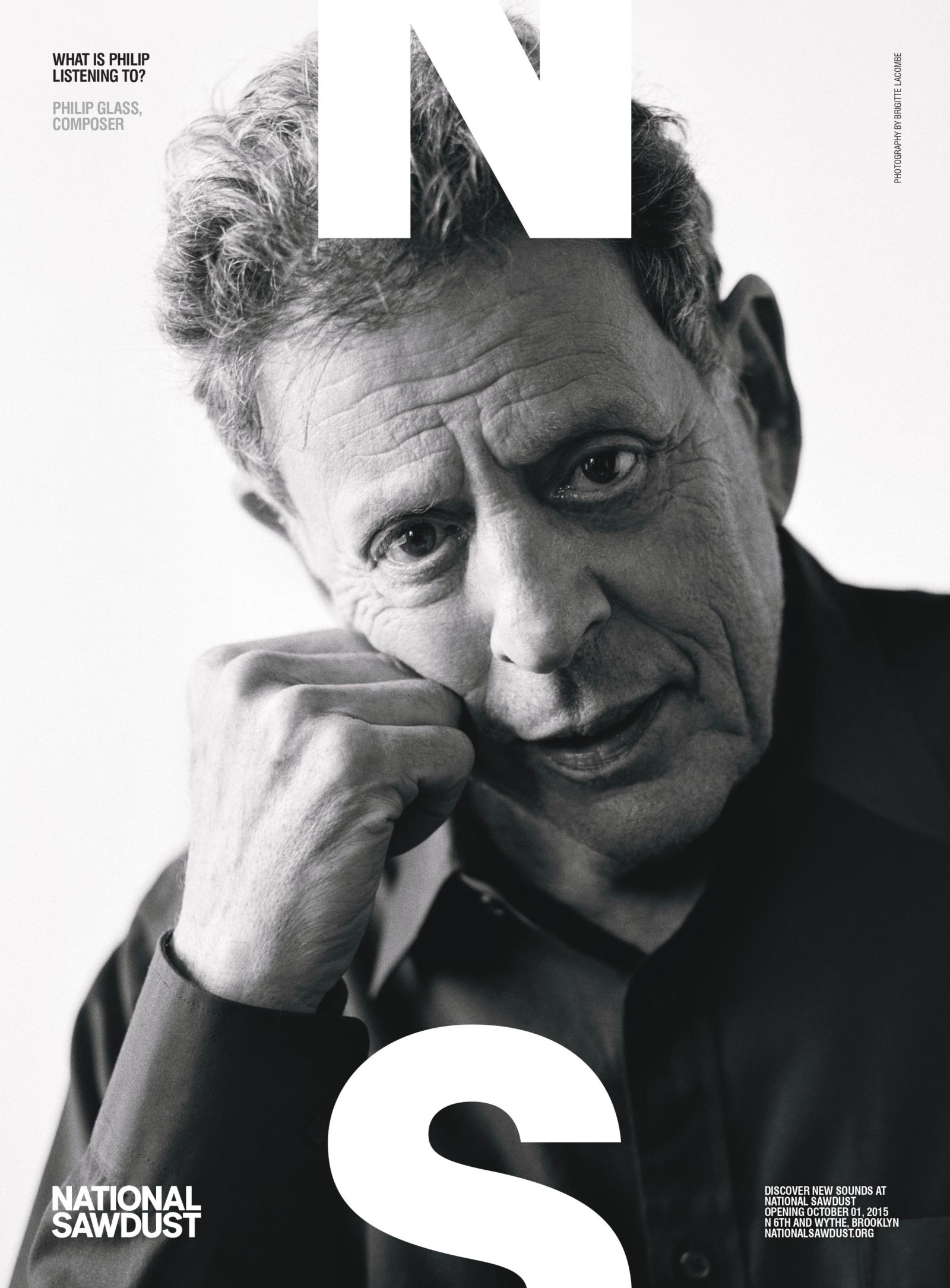
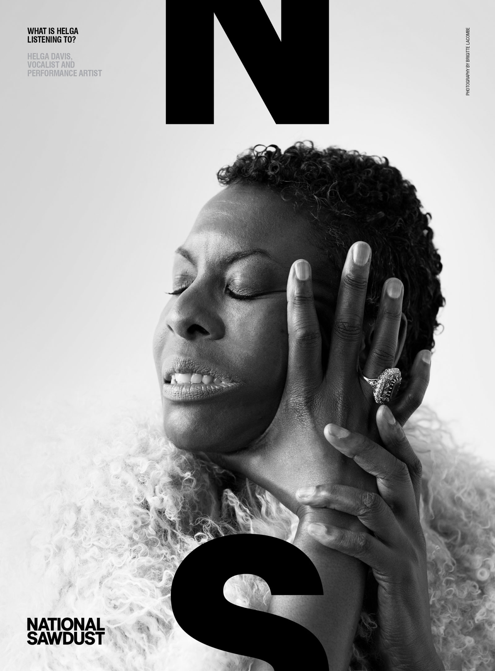
A ground up invention, the goal here was to build an incubator for avant-garde music, new creators, new audiences and a venue to house it all. Derived from Ezra Pound’s foundational modernist tenet – to “make it new” – the brand hinged on a simple promise: Hear it new! But what to call it? In this case, the peeling typography on the building itself, an iconic, graffiti-strewn brick warehouse in the heart of Brooklyn’s Williamsburg neighborhood, epicenter of a flourishing hipsterism, provided the solution: National Sawdust. The name was both high and low, grand and quotidian, obvious and weird. The design system followed: the N/S logo cropped top and bottom. Both North and South, top and bottom, framing the content but also pushing the edges, expanding beyond the frame. The system was intentionally simple, designed for a fledgling organization with limited resources and maximum aspiration.